
White space is an important part of promoting your brand to your target segment of the audience.
White space is the most underrated parameter of web design. That’s why when web design company or developer create white space between elements of a webpage or in a layout; most of us seem to think that’s a waste of space estate. As a result, we often call it “negative space”.
But what if white space is an important part of promoting your brand to your target segment of the audience? What if we tell you that back in 1930, Jack Tschichold wrote that “white space is to be regarded as an active element, not a passive background”? You may seem to be more curious, right?
So, let’s go back and understand “white space” from the beginning”.
What is “white space”?
First, have a look at the following picture and then we will talk more about it.

By looking at the picture, what do you think is more important? Two faces or the vase made of the “white space”? Here lies the value of “white space”. If the “white space” were not being used, it would’ve not been existent.
So whenever you are creating a design or trying to promote your brand, use the “white space” in the website appropriately.
Here’s more on “white space” so that after reading this article, you can go ahead and implement the “white space” the right way.
Types of “white space”
In web design, there are two types of “white spaces”.
- Macro: The white space you leave between the core elements in your website is called macro white space.
- Micro: The white space between the smaller elements of your website is called micro white space.
For example, go to google.ae and you would see the following –
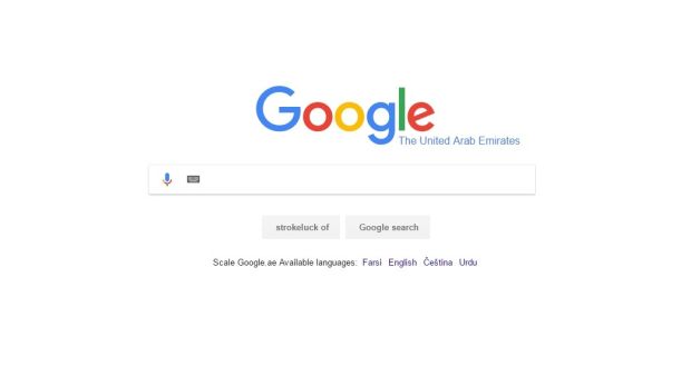
As Google is a famous populariser of white space in their web design, you can see that the white space between Google and search bar; that we would call “macro white space”. And the white space between “Farsi” and “English”, we would call “micro white space”.
White space increases readability
If you build websites or own one or hire a web design company, you want people to read your content. If your content is not being written using the right amount of “white space”, people would visit your site and bounce back to other sites where the readability is good.
If your design and content are cluttered and there is too little space in between, then it would be difficult for you to convert better. That brings us to the brand promotion and ad campaign.
White space enhances brand value
Take an analogy. Let’s say you went to your friend’s house and you found that the home is neat and clean and there is only one or two furniture in the room. A lot of spaces have been kept blank. How would you feel? You would feel expansive.
Similarly, if you go to your friend’s home and find that the whole room is cluttered with many, different things, you would immediately feel confined.
The website works the same way. When you leave the appropriate space blank, readers can take their time and read through whatever you have put up as content and advertising material. With proper use of white space, your readers feel expanded and thus, love to be in your website. And thus, your brand value increases and more and more people start to visit your site.
Yes, I agree that you need proof.
So here are the evidence shown below about “white space” to convince your left brain that “white space” matters more than you think.
An interface designer’s view on – Importance of “white space”
Luke Wroblewski, an interface designer mentions that for designers who create the web designs, white space is as important as the content. He also goes on to say that if the web designers change the padding and alignment (if there is less white space in between); it impacts readability and affects the visual acceptance of readers.
Here’s the proof –
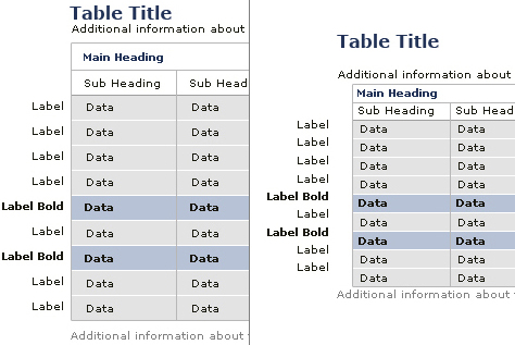
In the above example, you can see the actual design on the left side and the implementation of the design on the right side. Clearly, while implementing the padding and alignment, the web designers changed them and see what happened. It has reduced the readability and visual representation.
How white space affects brand positioning?
Talking about white space, Mark Boulton wrote an entire article on it. He says that white space is one of the great tools for web designers. They use this tool to enhance the sophistication and elegance of a brand.
Here’s an example which proves how white space affects a brand and its positioning.

If you look at both of these direct mails, you would see that content and photography are absolutely similar in both the cases. But on the left side there is less white space and the right side there is more white space. Clearly, we can see that “less white space” means “cheap” and “more white space” means “luxury”.
Importance of Active and Passive White Space
Most of the web designers are eager to talk about active white space, but even passive white space matters. Mark Boulton says that if passive white space is not given importance, it’s a bad design.
Let’s look at an example through which we can understand the importance of active white space and passive white space.

This piece needs active white space without which it won’t be possible to read it through.

Now the piece looks much better. And by changing the line space, margin, type family and weight, we have this neat looking piece. All of these are called “passive whitespace”.
In the final analysis
Visit your website or the website you are designing. Because if you are not paying attention to the white space, chances are you are losing out on a lot of potential customers and a lot of revenue for your business.