The balancing act between aesthetics and functionality is a tricky one. But that’s not to say it’s impossible.
We’re nearing the end of another year. And what a great one it has been for web design and development! We’ve seen just about everything crop up in 2017. Technologies that have been around for years are finally making it into mainstream media and are gaining traction. In fact, it was the year of minimalism, videos, virtual and augmented reality, and the mobile movement.
With 2018 just around the corner, we thought it would be apt to gather up the trends that are expected to rise up in the next year. The balancing act between aesthetics and functionality is a tricky one. But that’s not to say it’s impossible. When done right, it could set your business up for increased user engagement and higher conversion rates. So without further ado, here are our top picks of web design and development trends to look out for in 2018!
Mobile will be a top priority.
Having mobile as a priority is nothing new. In fact, it has been around for the last few years. According to Statista, 43.6% of all website traffic worldwide was generated through mobile phones in 2016. And it’s not slowing down anytime soon! Developers will have even more reason to prioritize mobile as Google begins rolling out its new Mobile First Index in the first half of 2018.
Accelerated Mobile Pages (AMPs) will also become more important in the next year. The open-source coding standard enables web pages to load faster than regular mobile sites. Essentially, this is done by stripping down the code to make it less clunky and easier to load. So whether you’re redesigning your website or just launching one, a mobile or AMP version is a definite must for the incoming year!
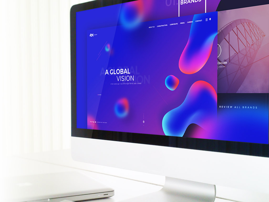
Bold typography and colors are in.
2018 won’t bring too much change in terms of websites’ overall look and feel. For the most part, web design will continue on the track of minimalism. However, you can expect to see designers start playing with bold typography and eye-catching colors. Websites with text-based designs quickly communicate messages to users which is essential in the age of information.
Scroll-triggered animations will come to play.
By definition, scroll-triggered animations are used to engage users to interact with your website as the content unfolds. It’s a step away from the traditional load-and-view website. Although this technique is not new, developers are starting to use it in a new and interesting way that captures users’ attention. In fact, these kinds of animations not only engage the users but also make your website cleaner. Instead of a series of menus and buttons, your website comes alive!
Sticky elements will shift to the bottom.
We have been used to sticky elements appearing on top of web pages and apps for the longest time. But thanks to mobile apps, users are getting used to tapping on the bottom of the screens. This is why we’ll begin to see sticky elements being shifted to the lower part of a website. Ultimately, progressive web apps like Twitter are responsible for this influence. So keep your eyes peeled for the move!
Security measures will reach an all-time high.
The internet is a powerful tool, one that innumerable people have manipulated for their gain. In 2017, malicious hacking has become an even bigger issue and has raised an incredible amount of caution among both site owners and users.
In 2018, security measures will reach an all-time high as companies and brands try to reinforce and build trust among site visitors.
Cinemagraphs will add magic to the web.
Though images still play a critical role in web design, videos have drastically changed the dynamics of information dissemination in 2017. In fact, we’ve seen a number of websites who have started using videos on their websites to quickly capture the attention of site visitors. The only downside? Videos make websites load sluggishly.
Enter cinemagraphs. These perfect blends of static images and videos are predicted to take over web design trends in 2018. These quick snippets of animations create a dynamic and interactive space, ultimately capturing the magic of moving photographs like the ones we see in movies like Harry Potter.
Scalable vector graphics (SVG) will overtake other image formats.
Scalable vector graphics are not new to the incoming year. But regardless, expect to see a rise in its use on websites compared to traditional image formats like JPEG, GIF, and PNG. By definition, SVGs are vector images which give designers and developers a greater advantage versus other formats. They are incredibly scalable without compromising on the image quality and affecting site loading speed!
Responsive design will remain a priority.
Gone are the days when responsive design was a trend. Year after year, the need for a responsive design has been considered a fad but today, it has evolved to become a principle. In 2018, expect this design element to expand exponentially as businesses and brands continue to grapple with reaching as many audiences as possible and provide them with the best user experience their website can offer!
There is nothing more exciting than seeing what the New Year has to bring for web design and development. As new technology is developed, so will new ideas, techniques, and concepts for websites, too!

 Have a project in mind? Get in Touch